Logos & Colors
While our new name, IDEA, is rooted in our history, our new visual identity will help tell IDEA's compelling story in a modern way and with one galvanizing brand.
There is no primary or secondary logo. Members are encouraged to use their judgment on which logo is appropriate for your advertisement, website, flyer, social media post, and so on. In our style guide, we provide recommendations on when to use each logo. Both versions equally represent our alliance and provide ultimate flexibility so you can choose what fits or looks best in the space you’re working with.
DOWNLOAD THE IDEA STYLE GUIDE (PDF)
The accent in our logo, the logo mark, represents an arrow with upward trajectory and forward momentum. It represents the drive and motivation of our students who aspire to advance in their professional careers, often working in fields where they have the power to change people’s lives. It also represents the future-focused vision of IDEA “to be a leader among online, global consortia.”
This logo mark also provides a subtle nod to the presence of technology in our consortium, representing the online nature of our courses and programs. Whether learning, teaching, or supporting, we all spend a lot of time on the computer and that logo mark looks a lot like a computer mouse on the screen.
Our stacked logo should be used on various applications such as digital, print, web, and merchandise. Variations of this logo include an all-white and all-black version to be used on contrasting backgrounds.
The stacked logo is ideal (but not limited to) for usage on digital mediums such as social media posts, profile photos, images, and instances where space is limited. This logo also applies well on top of solid shapes for a dynamic look.
Our horizontal logo should be used on various applications such as print, web, and merchandise. Variations of this logo include an all-white and all-black version to be used on contrasting backgrounds. The horizontal logo is ideal (but not limited to) for usage on print mediums such as document headers. It can also be utilized online and in print for areas where the stacked logo does not fit.
The color palette is fresh and modern. These colors were chosen to communicate an energetic, inviting, and professional tone to our audience. Access this color palette in the Style Guide (PDF) on page 14.
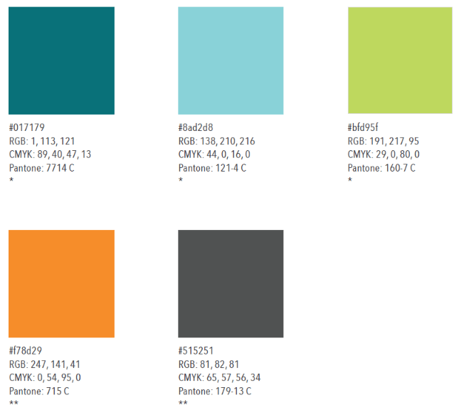
*Primary color
**Secondary color- Expand All
